‘Shelf Styling’ used to consist of popping a few books, a couple of photos and a random selection of holidays souvenirs on the nearest flat surface and the job was done. However, like so many other aspects of our lives, social media has changed it all. While you may not actually be posting pictures of your ‘#shelfies’, you’ll have seen plenty of examples of other people’s beautifully curated wall-scapes and may have started to cast a more critical eye over your own. Pinterest and Instagram have a lot to answer for!
Although it’s true that shelf styling has been elevated to something of an art form in recent years, I still believe that above all, a home should reflect the people who live there and the objects on display should make you happy. That said, there are some simple styling rules that can help ensure your decorative accessories are displayed in their best light. Our interior Décor Expert, Ash Young of Adore Décor DXB, is back to share her top tips on creating the perfect ‘Shelfie’.
What’s the Context?
If you want to achieve a cohesive & pulled-together look, then it’s important to maintain a relationship between the objects you’re grouping together on a shelf with the rest of the room (for bonus points!) For example, if you are aiming for a modern, minimal living room, then your grandmother’s collection of teacups will need to go somewhere else.
Keep Colour Control
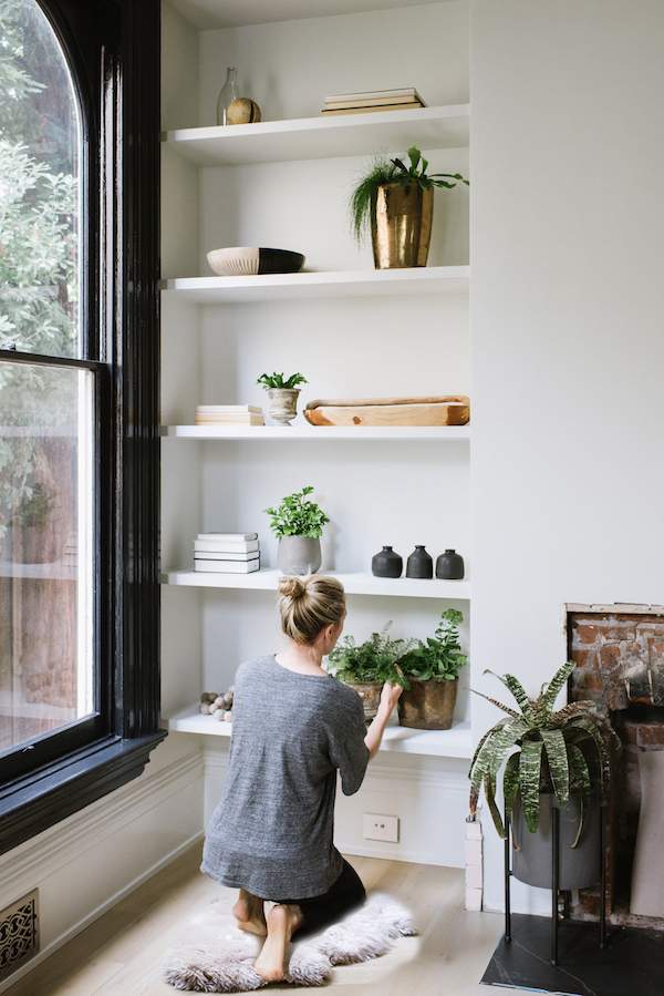
Keeping to a restrained colour palette is a great way of unifying both your collection of accessories and the rest of the space. Note: ‘restrained’ doesn’t have to mean neutral or boring, but rather, limiting the number of colours involved so that things don’t get too chaotic. If your palette is limited to just a few colours, then you can add interest with objects of contrasting size, shape and texture.
However, if a riot of glorious technicolour is what brings you joy, then don’t let me stand in your way! You can still achieve a curated look by ensuring an overarching theme to your display; such as sticking to items from one country, or only using those that are made from a single material: e.g. a collection of vibrant Moroccan pottery.

Image via https://apartment34.com
1-2-3
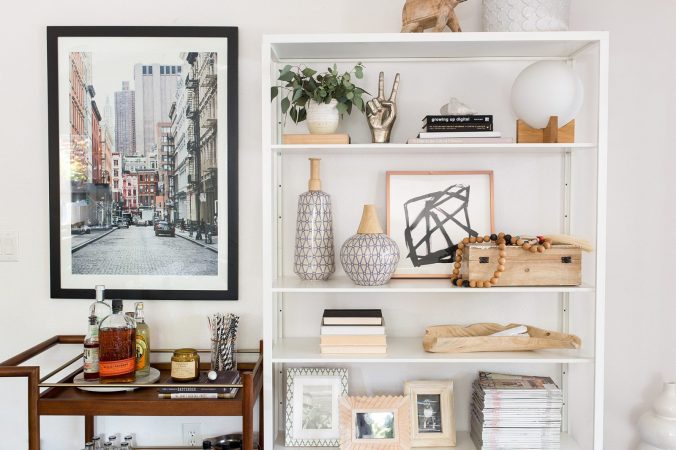
When it comes to the arrangement of your items, start with your largest pieces first before filling the gaps with smaller ones. Try positioning two of the same medium-sized items next to each other as a smart pair, while smaller items can be grouped together in a set of three or placed on a stack of books. The maximalists among you can fill the entire space; even layering shorter objects in front of taller ones. The minimalists, however, can keep their display sparser by leaving deliberate gaps or empty frames and allowing each piece to stand on it own.

Image via: http://designshopinteriors.com/
Candles, photo frames, decorative ceramics, baskets and books are all styling staples, but don’t forget to add character and individuality with objects that reflect your personal taste. Try including some metallic items to catch the eye and bounce light around, and don’t be afraid to mix your metals. Organic, sculptural pieces often help soften hard lines, while plants (artificial or real) will add life to the overall look.


