Five DIY Home Interior Tips For Making A House A Home
Our talented interior décor expert Vivane Khoury at @Byvianehoury is back with more pearls of DIY interior design wisdom! This time, she shares her top five ‘do it yourself’ tips, which can make all the difference to your home’s aesthetic. Over to you Viviane!

This post was co-written by our interior/decor expert contributor @Byvivianekhoury (Above).
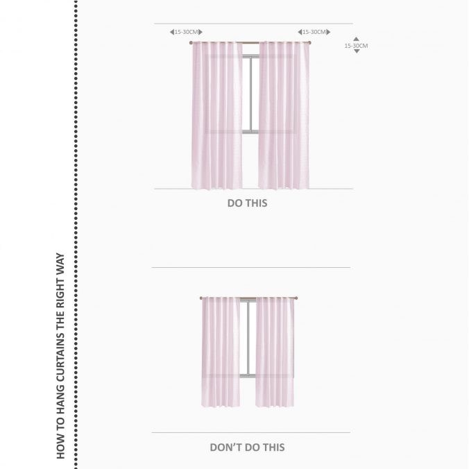
1-The dos and don’ts of curtain placement
Curtains complete the look of any room; they can add warmth and texture to the space. When it comes to curtain placement, little changes can make a huge impact!
Here are below my top tips for curtain placement:
- Don’t position your curtain rod directly above the window frame, it makes the ceiling look shorter. The higher the curtain rod, the taller the window will appear. So, mount your curtain rod closer to the ceiling or position it 15-20cm above the window frame.
- Select a curtain rod that is wider than the width your window. It will give an illusion of a wider window. Extend the rod 15-20cm on each side of the window frame.
- Make sure the fabric just skims the floor.
Here is an example of a perfect curtain placement done by interior stylist @baytkalthoum
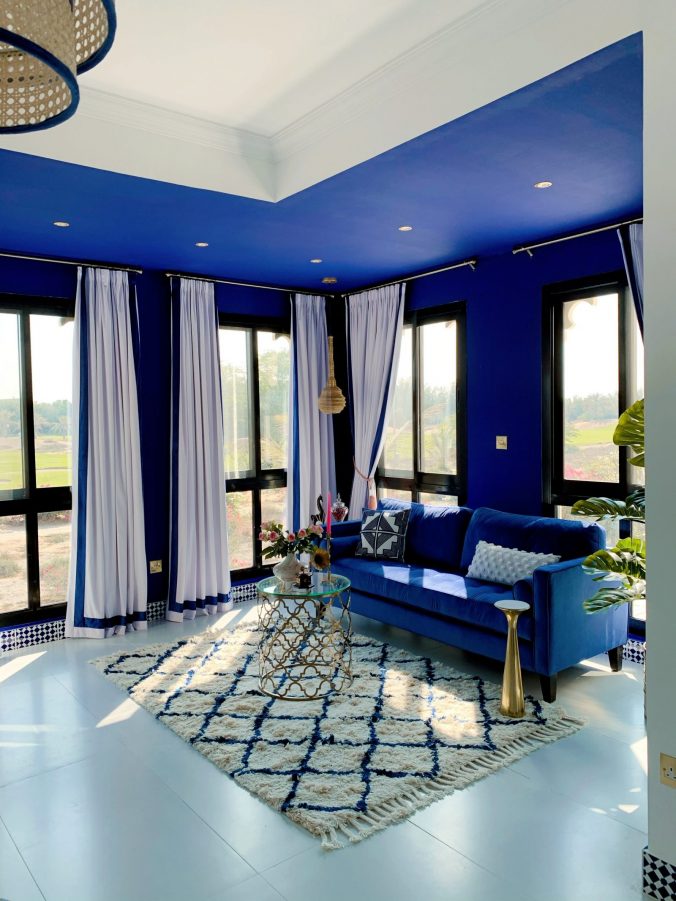
Image via: @baytkalthoum
2-How to choose a rug
It is amazing how the right rug can make a room feel smaller or spacious, depending on their size and where you place them. Smaller rugs will make a room look smaller and the furniture disconnected, while larger rugs will unify and define the space.
For living rooms, the rug should be in proportion to the size of the furniture. Ideally, place the rug in the center under the coffee table and place the front legs of your sofas and armchairs on the rug.
Standard rug sizes:
160 x 230cm
200 x 290cm
250 x 350cm
300 x 400cm
Here is an example of a beautiful living room designed by Reem @fashion.gone.home.
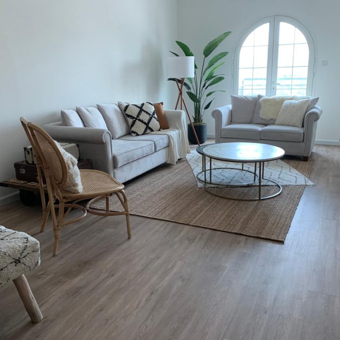
Image via: @fashion.gone.home
The rug adds coziness and texture to the space, and Reem created a dymanic focal point by layering another rug off centre.
3-How to style your bed with pillows
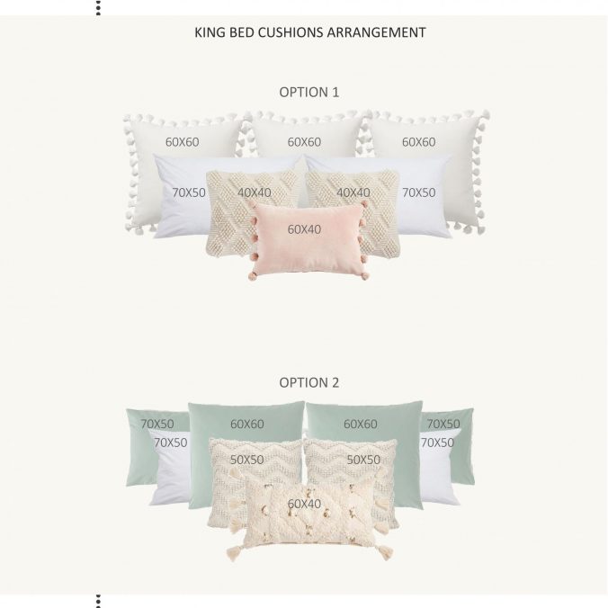
Styling your bed with decorative pillows is likeartwork; balance should be there when selecting the right size pillows and the correct quantity for your bed. Too few pillows will leave your bed feeling bare, and too many will lead to confusion.
Here is a guideline for styling your king bed size with pillows:
Below is an example of how Antonia Fosberry, Founder of BOXI Creative, styled this master bedroom beautifully. She started with a row of standard pillows, then three squared pillows and finally, two accent pillows.
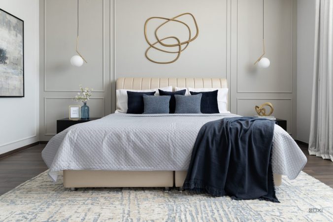
Image via BOXI Creative.
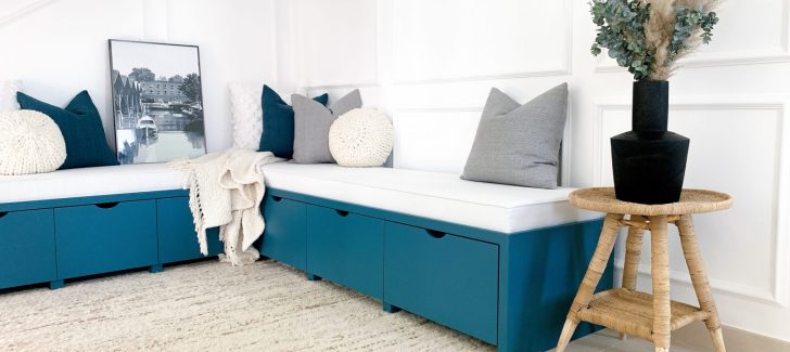
4- How to style cushions on a sofa
Cushions add character to any space but putting them together can be very confusing and frustrating.
Here are below some tips how to easily put cushions together:
- Start from the outside with at least 60x60cm or 50x50cm square shape.
- Layer smaller cushions in front of the larger ones.
- Don’t be afraid to mix and match textures, colors, and patterns.
- Use an accent cushion at the center front row, it can be different color, shape, and pattern.
- Use an odd number of cushions.
Here are two pictures of living rooms designed by interior stylist Natalia from @mizannadesigns
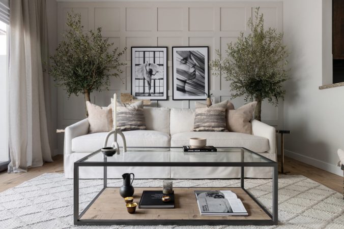
Image via @mizannadesigns
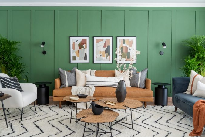
Image via @mizannadesigns
5- Styling under the stairs
Out of all the home design challenges, figuring out how to style that awkward space under the stairs is the trickiest one.
Here are some ideas on how to utilise this space wisely:
- Extra storage drawers and cabinets
- Kitchen pantry
- Reading nook
- Home office
- Hidden playroom
- Wine cellar
- Bookshelves
- Coat closet
- Wet bar
An example of a clever design created by Neeshay @thenichecornertnc. She transformed the space into something welcoming, functional and comfortable.
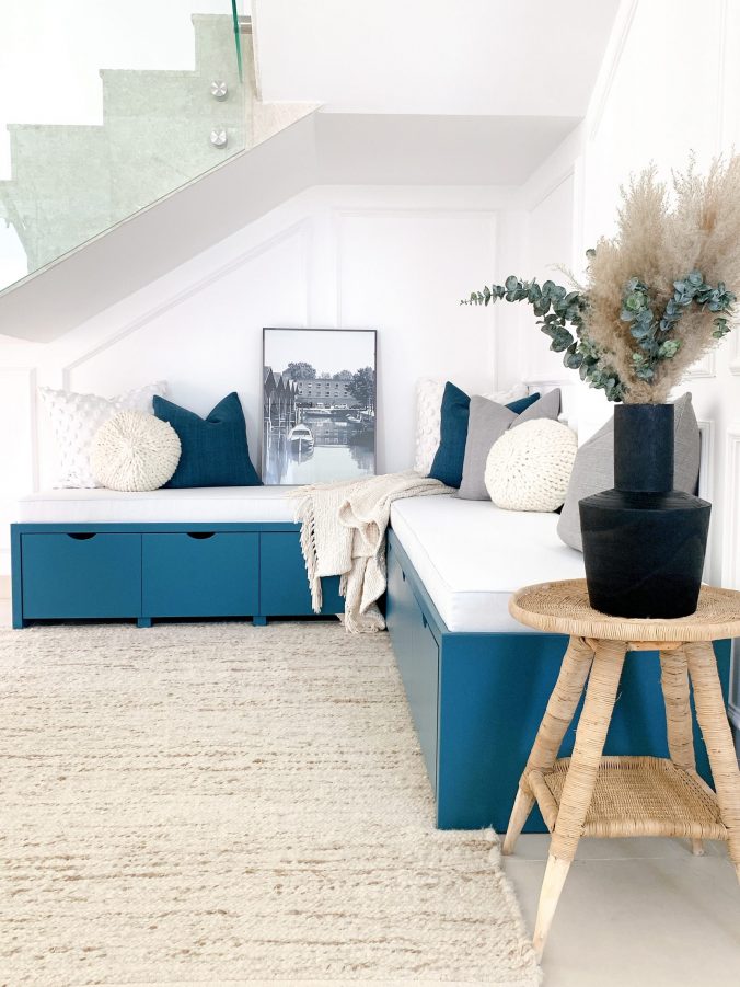
Image via @thenichecornertnc
Remember to tag us @homeclubme in your DIY home decor posts, especially if they are inspired by our articles – let us know which tip you found easiest to implement and which you can’t wait to try next in the comments below. Thank you Viviane for sharing your interior expertise as always. See you next time Homies!


